Food truck logos are often the first impression made on potential customers. Because of this important fact you need to make sure yours is a good one.
The purpose of food truck logos are intended to be the “face” of your mobile food business: They are graphical displays of a company’s unique identity, and through colors and fonts and images they provide essential information about a food truck that allows customers to identify with your brand. Logos are also a shorthand way of referring to the company in advertising and marketing materials.
The Important Keys To Great Food Truck Logos
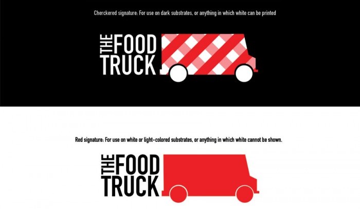
For starters, make sure it’s not too busy. If it contains a design, business name and a tag line, that’s probably too much. Start with a simple but interesting image and font and get feedback from a lot of people before deciding whether to go with it.
RELATED: Creating A Food Truck Logo That Matches Your Brand
Study other food trucks around the country as well as trucks in your area to see what they do and then try to differentiate yourself without going too far. If you aren’t a graphic designer consider hiring one. You don’t want your logo to look like it was designed by an amateur.
RELATED: Creating Successful Food Truck Logos
Some food trucks I’ve seen, play it fast and loose with logos. They pay insufficient attention to proper size and positioning. I’ve also seen where they surround them with materials (including clip art) that compete with them visually.
The Bottom Line
You may not wind up with the next Golden Arches, but with any luck you’ll get a logo for your food truck business that symbolizes what you do and makes a lasting impression in the process.
We’d love to see your food truck logos and share our favorites with the rest of our readers. If you are so inclined, you can share them with us via email, Twitter or Facebook.